
Have you ever looked at the sky just after sunrise and noticed that soft blue-green color between the deep blue above and the warm light near the horizon? That beautiful in-between shade is very close to what we call cyanová. It is a color that many people see every day but do not know by name.
What Does “Cyanová” Mean?
The word cyanová comes from the Czech and Slovak languages. In those languages, it simply means cyan — a bright blue-green color. The word itself is connected to the Greek word kyanos, which means dark blue or blue-green. This is also the root word for many color terms in science and art.
So if you are looking at a color chart and you see “cyanová,” you are looking at the Czech or Slovak name for cyan. It is not a new color — it is just a different name for a color that has been around for a very long time.
What Color Is Cyanová Exactly?
Cyanová is a bright blue-green color. It sits between blue and green on the color wheel. In the world of printing and design, cyan is one of the four main colors used in the CMYK color model (Cyan, Magenta, Yellow, and Key/Black).
Here is how cyanová looks in numbers:
- Hex code:
#00FFFF(for pure cyan) or similar shades like#00BCD4 - RGB values: R: 0, G: 255, B: 255 (for pure cyan)
- CMYK: C: 100%, M: 0%, Y: 0%, K: 0%
The color feels fresh, clean, and energetic. It is bright without being harsh. Many people describe it as the color of clear tropical water or a clear sky on a sunny day.
There are also many shades related to cyanová:
- Light cyan looks almost white with a blue-green tint
- Dark cyan is deeper and richer, closer to teal
- Cyan blue leans more toward blue
- Cyan green leans more toward green
Each shade gives a slightly different feeling but they all belong to the same color family.
A Short History of the Color Cyan
Cyan has a rich history that goes back hundreds of years. The color was not always easy to make. In early times, artists had to use natural materials to create blue-green pigments. Some came from minerals like malachite or azurite. Others came from plants.
The word cyan became widely used in the world of photography and printing in the 1800s. When color printing technology started to develop, scientists and printers found that you could mix just three or four colors to create almost any other color. Cyan became one of those key colors because it can help make blues, greens, and many other shades.
In the 20th century, as computers and digital screens became common, cyan became even more important. On screens, colors are made using light (the RGB model). Cyan on a screen is made by mixing green and blue light together at full strength. This is why it looks so bright and vivid on digital displays.
The Czech and Slovak word cyanová followed this same history, used especially as color printing and digital technology spread through Central Europe.
Cyanová in the World of Design
Today, cyanová (cyan) is one of the most used colors in modern design. Here is why designers love it so much:
1. It Grabs Attention Without Being Aggressive
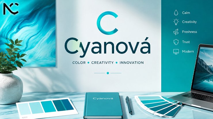
Some colors, like bright red or orange, feel very strong and can feel a bit aggressive. Cyanová is different. It is bright and eye-catching, but it also feels calm and refreshing. This makes it great for designs that want to stand out without feeling too loud.
2. It Works Well With Many Other Colors
Cyan pairs beautifully with:
- White for a clean, modern look
- Black for a bold, high-contrast design
- Dark navy blue for a professional and trustworthy feel
- Coral or orange for a lively, energetic contrast
- Purple for a creative, artistic combination
This flexibility is one reason why cyanová appears in so many different types of design projects.
3. It Feels Fresh and Modern
Trends in design come and go, but cyan has stayed popular for many years. It has a quality that feels both modern and timeless. You can see it in tech company logos, health and wellness brands, social media graphics, app interfaces, and much more.
4. It Connects to Nature and Technology at the Same Time
Cyan reminds people of water, sky, and nature. But it also looks very “digital” and modern. This makes it useful for brands that want to feel both natural and innovative — like technology companies that also care about the environment.
How Cyanová Is Used in Different Fields
In Graphic Design and Branding
Many well-known brands use cyan or similar shades in their logos and visual identity. The color communicates trust, innovation, and clarity. Tech companies, healthcare businesses, and communication platforms often choose this color for exactly those reasons.
In Interior Design
In home and interior design, shades of cyan are popular for creating a calm and open atmosphere. Light cyan walls can make a room feel bigger and more airy. Deeper teal shades (which are close relatives of cyan) give a more sophisticated and cozy feeling. Cyan works especially well in bathrooms and bedrooms where people want to feel relaxed.
In Fashion
Cyan and turquoise (a warm version of cyan) have always been popular in fashion. They work well in summer collections because they remind people of the beach, the sea, and sunny days. Cyanová tones appear in dresses, accessories, sportswear, and even makeup trends.
In Art and Photography
Artists and photographers often use cyan tones to create mood and atmosphere. In traditional film photography, the cyan channel is one of the three color channels (along with magenta and yellow) used to create full-color images. In digital art, cyan is used to add depth, create cool lighting effects, and give artwork a futuristic or underwater feeling.
In Science and Medicine
Interestingly, cyan and related blue-green colors also appear in science. Some medical imaging technologies use false-color images where cyan highlights certain areas of the body or cell structures. In biology, the word “cyanobacteria” describes a type of blue-green algae, which gets its name from the same Greek root as cyanová.
The Psychology of Cyanová
Colors affect how we feel and think, and cyanová is no different. Here are some of the feelings and ideas that people often connect with this color:
Positive associations:
- Freshness and cleanliness
- Calmness and peace
- Trust and reliability
- Creativity and openness
- Energy and movement
In different cultures:
- In many Western cultures, blue-green colors are connected to calm, intelligence, and nature.
- In some Asian cultures, blue-green shades are connected to healing and spiritual clarity.
- In technology and digital culture, cyan often signals innovation, speed, and forward thinking.
This is why so many brands in healthcare, technology, communication, and wellness choose cyan and related shades for their visual identity.
Cyanová vs. Similar Colors: What Is the Difference?
Many people confuse cyanová with other similar colors. Here is a quick guide:
Cyan vs. Turquoise: Turquoise is a warmer, slightly greener shade. Cyan is purer and more blue. Turquoise often looks like a natural stone color, while cyan feels more digital and vivid.
Cyan vs. Aqua: Aqua and cyan are very close. “Aqua” is often used in web design as another name for cyan. In some systems they are exactly the same color. However, aqua can sometimes refer to slightly softer, lighter versions of the color.
Cyan vs. Teal: Teal is darker than cyan. It has more grey or green mixed in, which gives it a more sophisticated and subdued feeling. Cyan is brighter and more vivid than teal.
Cyan vs. Sky Blue: Sky blue is lighter and less saturated than cyan. Sky blue feels soft and gentle, while cyan feels more energetic and bright.
Tips for Using Cyanová in Your Own Projects
If you want to use cyanová in a design, here are some practical tips:
- Use it as an accent color. Cyan works great as a highlight color on a white or dark background. A little bit goes a long way.
- Combine it with neutrals. Pairing cyanová with white, grey, or black keeps the design balanced and professional.
- Try different shades. Do not limit yourself to pure cyan (
#00FFFF). Explore softer shades like#48CAE4or deeper ones like#0077B6for different moods. - Think about your audience. Cyan feels fresh and modern, which works well for younger audiences or tech-focused projects. For more traditional or luxury projects, consider a deeper teal instead.
- Use it in gradients. Gradients that go from cyan to blue or from cyan to purple look very modern and are popular in digital design right now.
Final Thoughts
Cyanová is more than just a word from another language. It represents a color with a long history, real importance in design and technology, and strong connections to how we feel and experience the world around us. Whether you call it cyan, cyanová, aqua, or just “that blue-green color,” this shade has a way of making things feel fresh, modern, and full of life.
Next time you see a tech company website, a medical poster, a clear blue-green sea in a photograph, or even the sky at just the right time of day, take a moment to notice that color. There is a good chance you are looking at something very close to cyanová.
Understanding colors like this one can help you make better choices in design, art, fashion, or even just how you decorate your home. Colors have a language of their own, and now you know a little more about what cyanová is saying. Templates Share
Frequently Asked Questions About Cyanová
Q1: What language is the word “cyanová” from?
Cyanová is a Czech and Slovak word. It is the Czech/Slovak name for the color cyan, which is a bright blue-green color. The root of the word comes from the ancient Greek word kyanos, meaning blue-green or dark blue.
Q2: Is cyanová the same as cyan?
Yes, cyanová is simply the Czech and Slovak word for cyan. They refer to the same color. In English, we say “cyan.” In Czech and Slovak, people say “cyanová.” The color itself is the same bright blue-green that you see in color printing models and digital design.
Q3: What does cyanová look like?
Cyanová is a bright, vivid blue-green color. It looks like the color of clear tropical water or a bright sky. In its purest digital form, it has the hex code #00FFFF. There are also many softer and darker variations, from light cyan (almost white with a blue-green tint) to dark cyan (similar to teal).
Q4: Why is cyan important in design and printing?
Cyan is one of the four main colors in the CMYK printing model (Cyan, Magenta, Yellow, Black). This model is used in most professional printing around the world. Without cyan, printers cannot create the full range of colors needed for high-quality images and designs. In digital design, cyan is also important because it is a primary color in the RGB light model.
Q5: What colors go well with cyanová?
Cyanová works well with white, black, navy blue, coral, orange, and purple. For a clean modern look, pair it with white and grey. For a bold and energetic design, pair it with coral or orange. For a professional and trustworthy feel, combine it with dark navy blue. Cyan is a very flexible color that can work in many different combinations depending on the mood you want to create.
Click for more amazing info. News Cora